MK | Chemical: A Match Made in Ping-Pong
“MK | Chemical: A Match Made in Ping-Pong” is a 60-second stop-motion psychological love story between a ping-pong ball and its paddle, a game of back and forth where the ping-pong ball becomes overly obsessed with the paddle while feeling confused by the physical nature of their relationship and the symbiotic roles that define both their existence.
This write-up provides insights into the creative process behind my stop-motion psychological love story between a ping-pong ball and its paddle for a Parsons School of Design online class. The story was based on the lyrics of a song by musician MK, and I used Ellen Lupton’s book, Design is Storytelling, as well as in-class readings and teachings to come up with a narrative arc that would guide the work.
I detail the thought process while creating the storyboard for the first 30 seconds of the video, explaining how it helped me visualise the narrative structure and pacing of the piece. However, I note that I deviated significantly from the storyboard during the actual creation process because things did not work on both a narrative and visual level. This led me to reflect on whether I needed to work harder on storyboarding or if my creative process is more intuitive and organic, informed by the objects and visual assets I work with.
I also discuss the use of visual aids in my work, particularly Gifs, which I describe as modern-day Chinese characters with incredible amounts of information packed into them. I explain that my work is abstract but has meaning behind it and that I enjoy playing with music and language to convey larger meanings. Additionally, I’m fascinated by all ways in which we communicate, including how non-native English speakers comprehend language with limited English.
Overall, this write-up provides a glimpse into my creative process and my reflections on creating a stop-motion love story inspired by a song. It highlights the challenges and rewards of the creative process and the importance of being flexible and open to change.
This piece was made for the Parsons School of Design online class Time-Based Storytelling at The New School. It was influenced by the book Design is Storytelling by Ellen Lupton and in-class reading and teaching. The story was based on the lyrics of the song by musician MK.
Make it stand out
Design Is Storytelling explores the psychology of visual perception from a narrative point of view. Presenting dozens of tools and concepts in a lively, visual manner, this book will help any designer amplify the narrative power of their work.
Good design, like good storytelling, brings ideas to life. The latest book from award-winning writer Ellen Lupton is a playbook for creative thinking, showing designers how to use storytelling techniques to create satisfying graphics, products, services and experiences.
By examining the first 60 seconds of the song's lyrics, I came up with a narrative arc that was first introduced to me in Ellen Lupton’s highly informative book.
The narrative arc I came up with:
Exposition: Introduction of the ping-pong ball and paddle
Rising Action: The ping-pong ball becomes overly obsessed with the paddle
Climax: The ping-pong ball and paddle combine in a game of ping-pong
Crisis: The ping-pong ball feels confused by the physical nature of their relationship and the symbiotic roles that define both their existence
2nd Crisis: The ping-pong ball is further confused and unsure of what it wants
Falling Action: The ping-pong ball expresses its desire for the paddle
Resolution: The ping-pong ball and paddle become undividable
Denouement: The ping-pong ball reflects on the intensity of their relationship and acknowledges that it is too chemical
If you don’t know, a narrative arc is the sequence of events that make up a story, including the exposition, rising action, climax, crisis, falling action, resolution, and denouement. It is the structure that gives a story its shape and coherence and helps to guide the audience's emotional response to the events of the story.
Make it stand out
The lyrics:
What's the catch with you
It's been way too physical
I've combined with you
It feels way too chemical
I, oh, I'm confused
I, oh, I want you
Undividable
It feels way too chemical
Ooh, yeah
You're the height of my concern
Ooh, yeah
I can't deny that I want you here
What's the catch with you (ooh, yeah)
It's been way too physical
I've combined with you (ooh, yeah)
It feels way too chemical
I, oh, I'm confused (ooh, yeah)
I, oh, I want you
Undividable (ooh, yeah)
It feels way too chemical
Way too chemical
Way too chemical
Way too chemical
It feels way too chemical
My narrative arc of the lyrics in graph form:
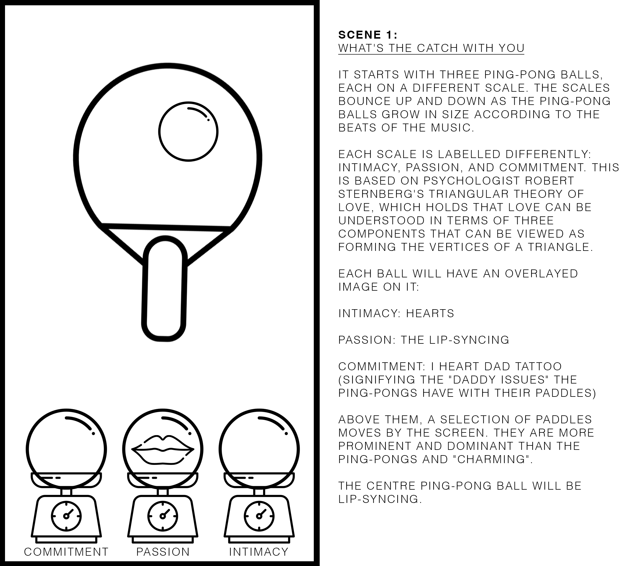
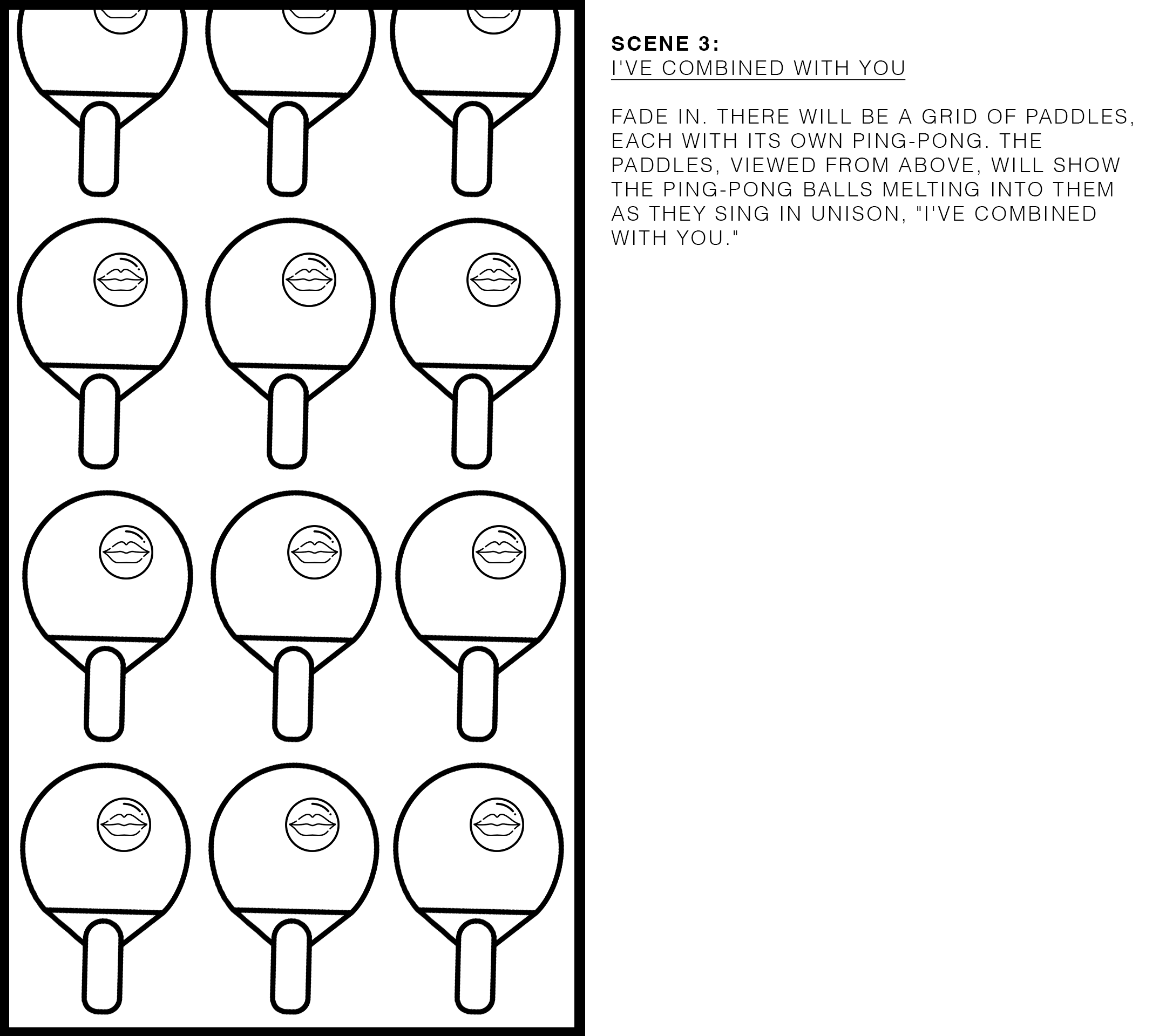
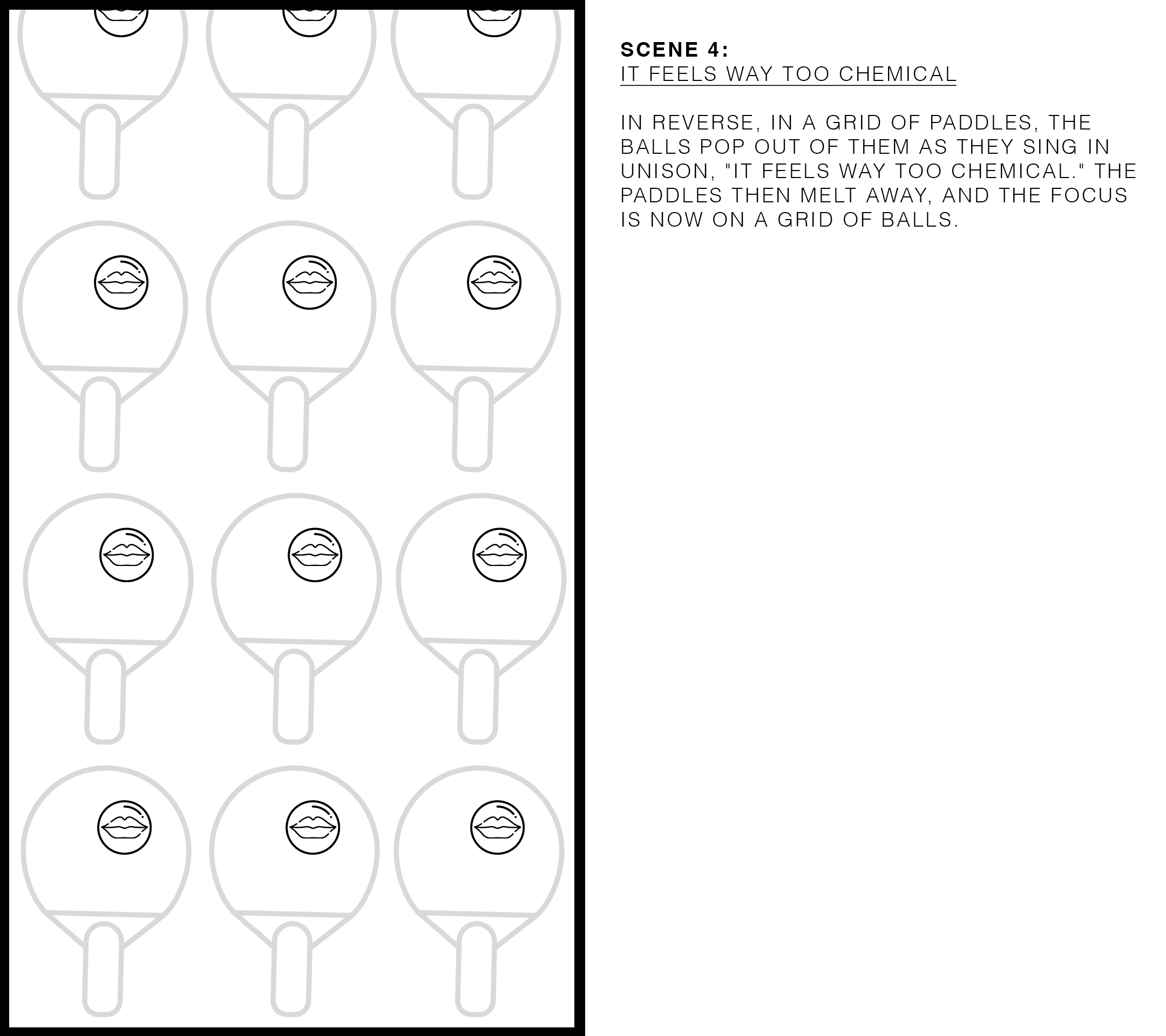
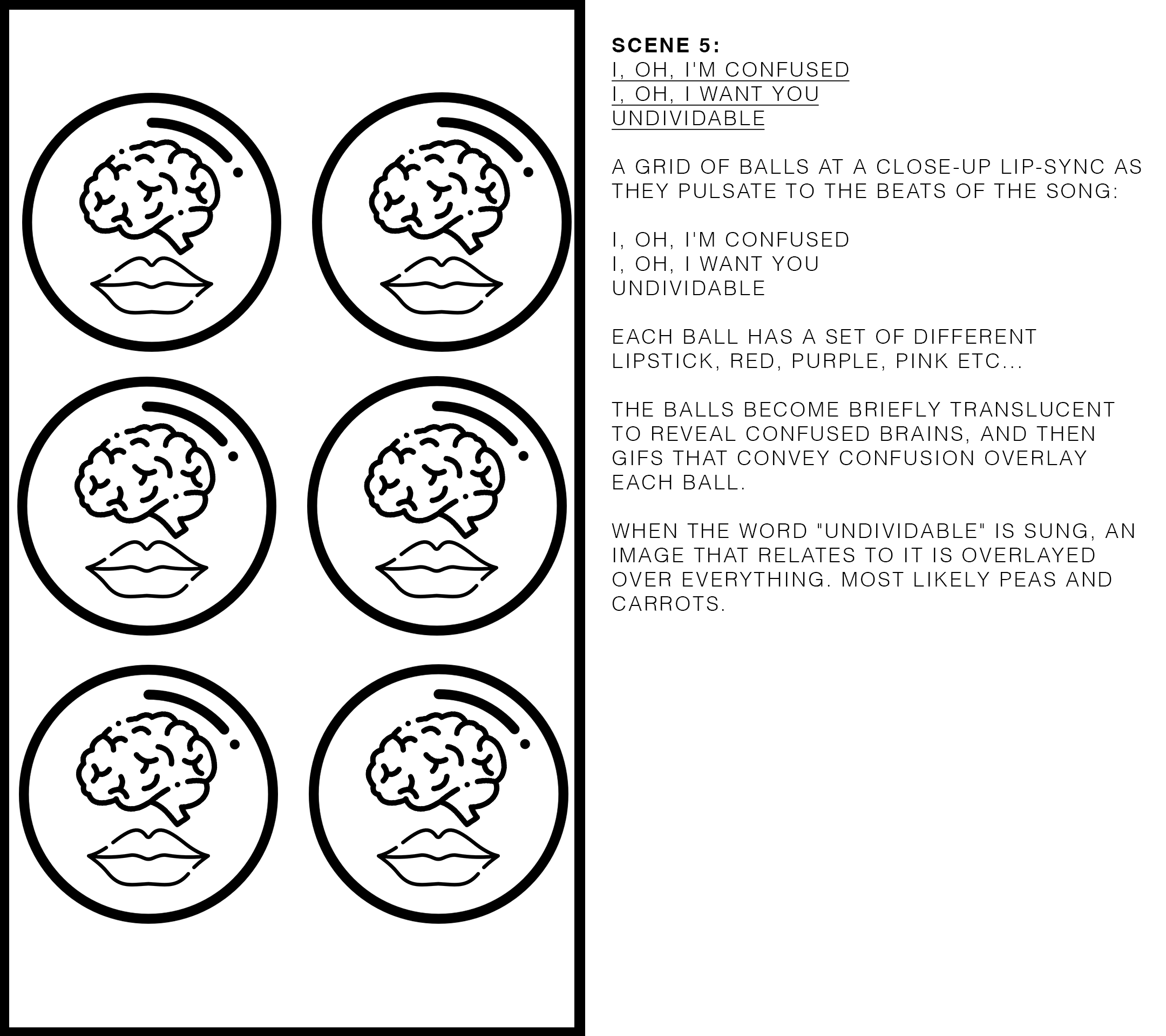
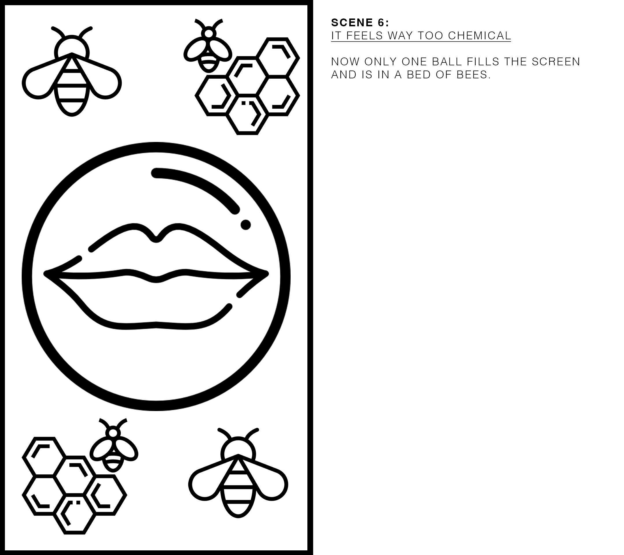
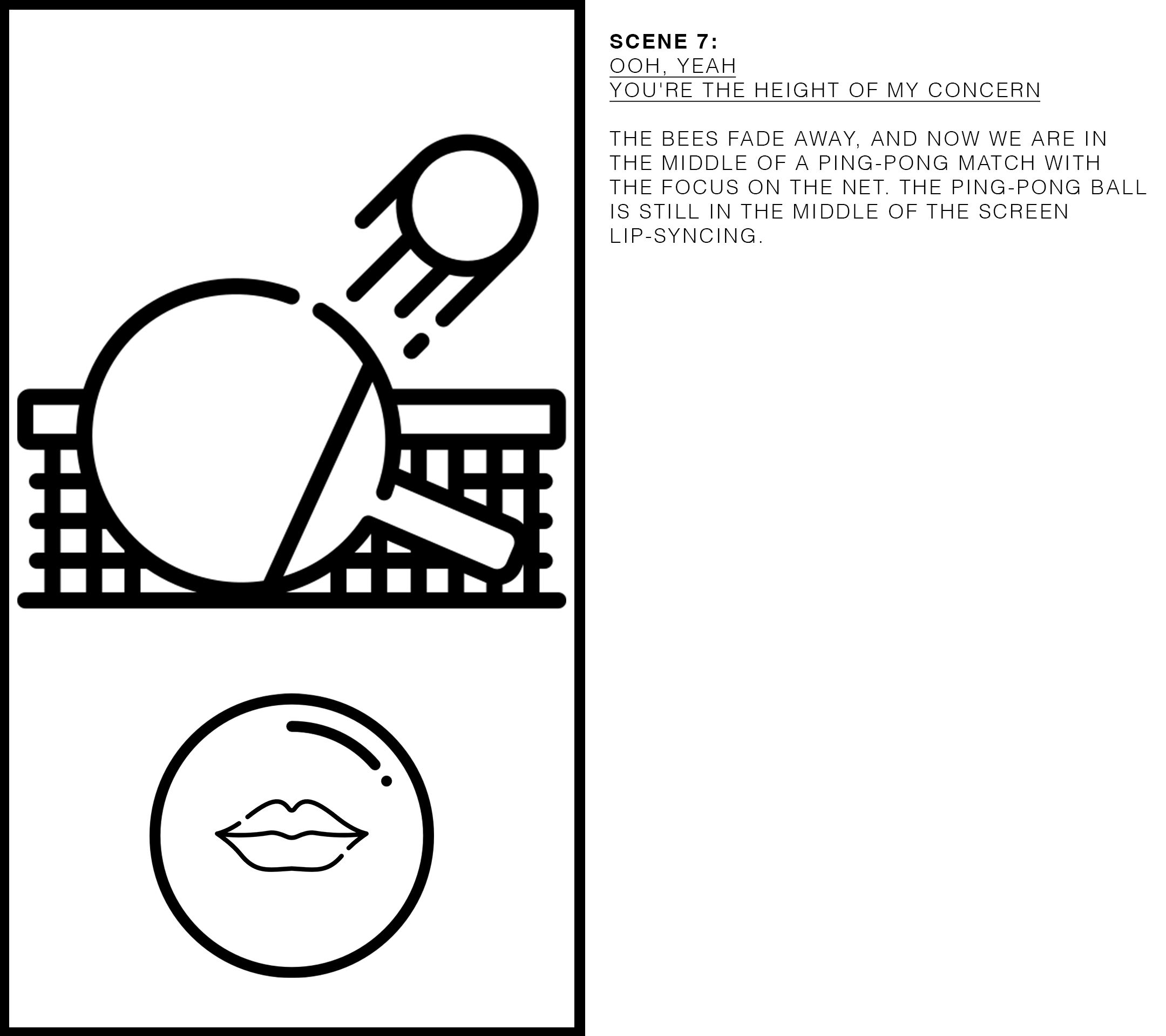
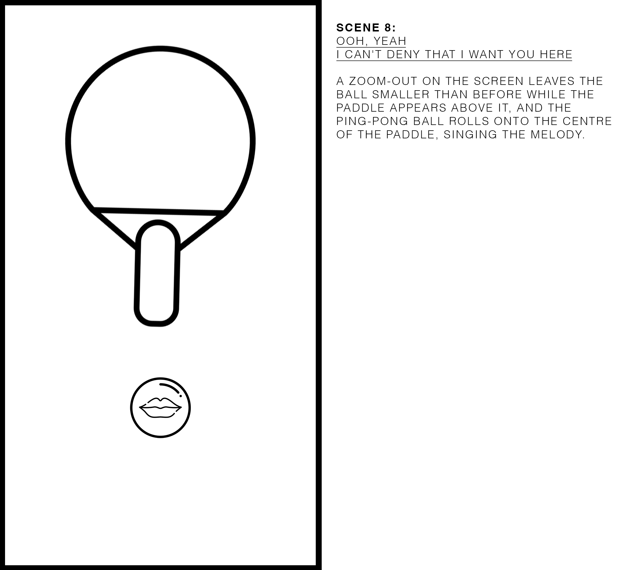
I then came up with a storyboard of the first 30 seconds to visually express what would be represented on the screen and to help inform me in making the video. I used simple icons to break down the information on the screen into simple elements that would give me a springboard to work from. As you can see, my storyboard is a form of sequential drawings or images used to plan out the shots and visual elements of a particular scene or sequence to help visualise the narrative structure and pacing. I also included text to include more information rather than include it visually. If I was working with a team, more so a client, I would have needed my storyboard to be actualised as a scene map, but since I was working alone on this, I used my storyboard as a jumping-off point.
Storyboard:
Visual assets:
Using the lyrics of the song as a starting point, I began to collect the creative assets that I would be using in the piece. For my assets, I use “found imagery”, mostly Gifs, for my work falls under the Fair Use category in that it is a parody of using found imagery already used in popular forms of communication to critique how we communicate and express ourselves in this modern form of communication. I deconstruct it and use it in bite-sized pieces to evoke emotions of pop-cultural nostalgia while also using it as a form of the way it is contemporarily used in society. My work is actively questioning and parodying language, and I must use all forms of modern communication to create such work. I've been fascinated by Gifs as a form of communication from the get-go, for they are culturally densely packed encyclopaedias of knowledge that are timestamps of specific eras.
For my own creative process, I collect both Gifs and use imagery found in the Smithsonian Open Access collection. I do not collect all my creative assets beforehand because the stop-motion work I do informs the creative assets I use and vice versa, and therefore, I take things step by step.
The draft:
The project's first week involved studying the metaphorical relationship between the ping-pong ball and the paddle and how it relates to our relationships in life. The piece I ended up making explored our longing for love and how nostalgia can be tied to a "place" that no longer exists. The ping-pong ball represented the constant movement between places and never having a "home". It touched on how love can be a search for a feeling we once had, similar to how we long for childhood memories or a home that no longer exists. Ultimately, we choose to love, just as the ball does, and we find comfort in nostalgia and memories. The song's "chemical" element may not be toxic, but sometimes what is closest to us can be the most confusing on a human level.
Breakdown of scenes 1-9:
Make it stand out
Scene 1:
Lyrics "What's the catch with you"
This scene was about the unequal balance in their relationship, and I tried to signify that with scales with one partner weighing more than the other. Visually I took cues from the word "catch", and I immediately thought of baseball, so I included a Gif of a hand playing catch. I like playing with word association, and it also reminds me of the multiple meanings words carry, and I try to convey that within my work. For I constantly in other languages I speak mess up words that sound the same but are in different contexts. Listening to music, I feel, is sometimes hard to contextualise, and you have to personalise it. In my music videos, I like to show a personal understanding of one's own relationship to how they first heard the song. I used a Gif of the iconic Adams family relationship because it's a relationship I never understood growing up. It's over the top, and here it's me kinda, asking them, "What's the catch with you?". My introduction of the Adams family Gif introduced nostalgia into the narrative of the piece right from the beginning. I had chosen different scales visually, but these were the only ones I could find at the market that I thought would work aesthetically.
My stop motion assets seen below for this were extremely simple. I used a green lapwork table I found at the supermarket for the green screen, and to get the paddle and ball to connect with each other, I connected them with a coloured metal paper clip.
Make it stand out
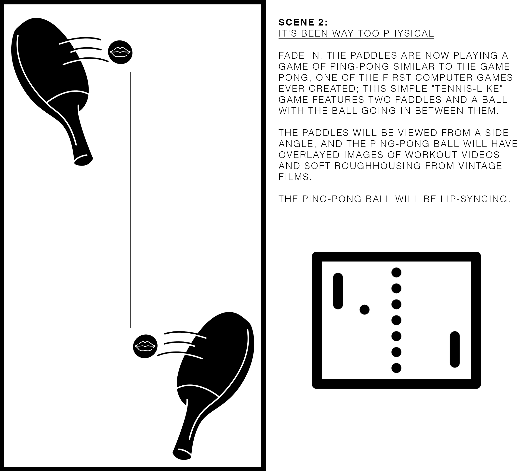
Scene 2:
Lyrics "It's been way too physical"
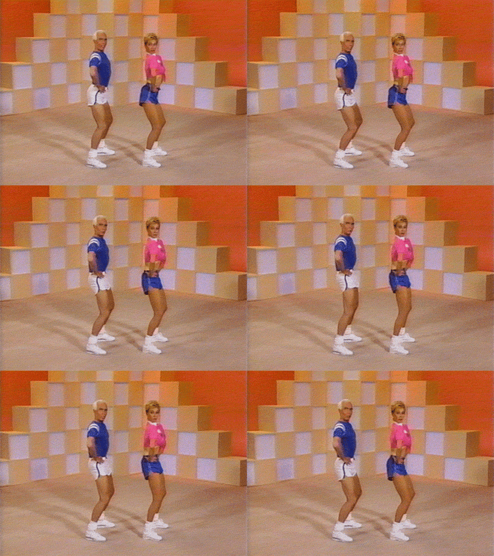
I wanted to show the actual physical nature of hitting the ping-pong ball and also the sexual undertones underneath it while also showing that it's a game we all play. I had to choose Jane Fonda because the moves are both sexual and physical, and Pong, the first computer game ever written, because, kinda like how "love" was probably the first human game ever written, both felt suitable.
Make it stand out
For stop motion assets, I had to film the paddle on the side for this shot which proved difficult, but I managed it.
Make it stand out
Scene 3:
Lyrics "I've combined with you" & "It feels way too chemical"
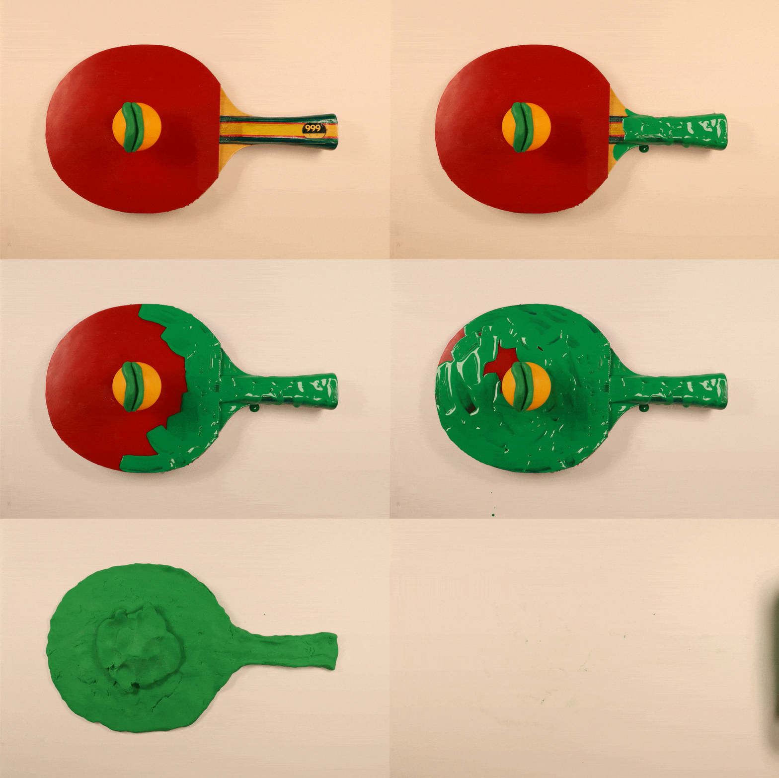
This was all about them connecting with each other and literally becoming "one". So I decided that the ball and paddle needed to morph into each other, and I wanted to use clay to do such a thing and visual aids to reinforce my message. Although very DIY stop-motion, I thought keying out green in Ae could do all the work. All I needed was green paint and green clay. What I did was first paint the paddle green and then the ball; once everything was green, I would replace it with a dummy version of a replica I made in green clay. Then I could both push the ball into the paddle, and the paddle could be peeled away to leave for a nice transition for the next scene. The hard part was that it needed to be a certain length for the part of the song since I would have the ball lip-sync in this section, and I couldn't have the ball move at all during the making, or it would ruin the lip-sync.
For the visual aspect of the piece, I regularly go to the Smithsonian Open Access website for images to use in my work. I went there and searched for historically relevant themed pieces that dealt with topics of "love". I picked this piece by Agostino Carracci, Italian, 1557 – 1602, at the Cooper Hewitt that dealt with Venus and Cupid to overlay over the piece. For references to "combined" and "chemical", I used a Gif from Captain Planet on the paddle. Then, I also used a texture from a Nepali Topi hat that is customary in Nepal and worn at wedding ceremonies.
Make it stand out
Here are the stop-motion assets. I'm embarrassed with how crude it looks, but that's the master of Ae in that you can work magic in post-production. Although I don't like how the lip-syncing turned out for this part, it is my fault for the shape of the mouth. I tried so many different mouths and thought that this one would be better, but it wasn't.
Make it stand out
Scene 4:
Lyrics "I, oh, I'm confused"
A scene that is all about confusion should have multiple aspects of confusion layered into it. In this one, I layered in a Brazilian drag queen that confuses people about gender identity and put in a Gif of math problems. I went for the literal.
Make it stand out
The stop-motion assets on this were also incredibly simple, and I didn't even use a green screen.
Make it stand out
Scene 5:
Lyrics "I, oh, I want you"
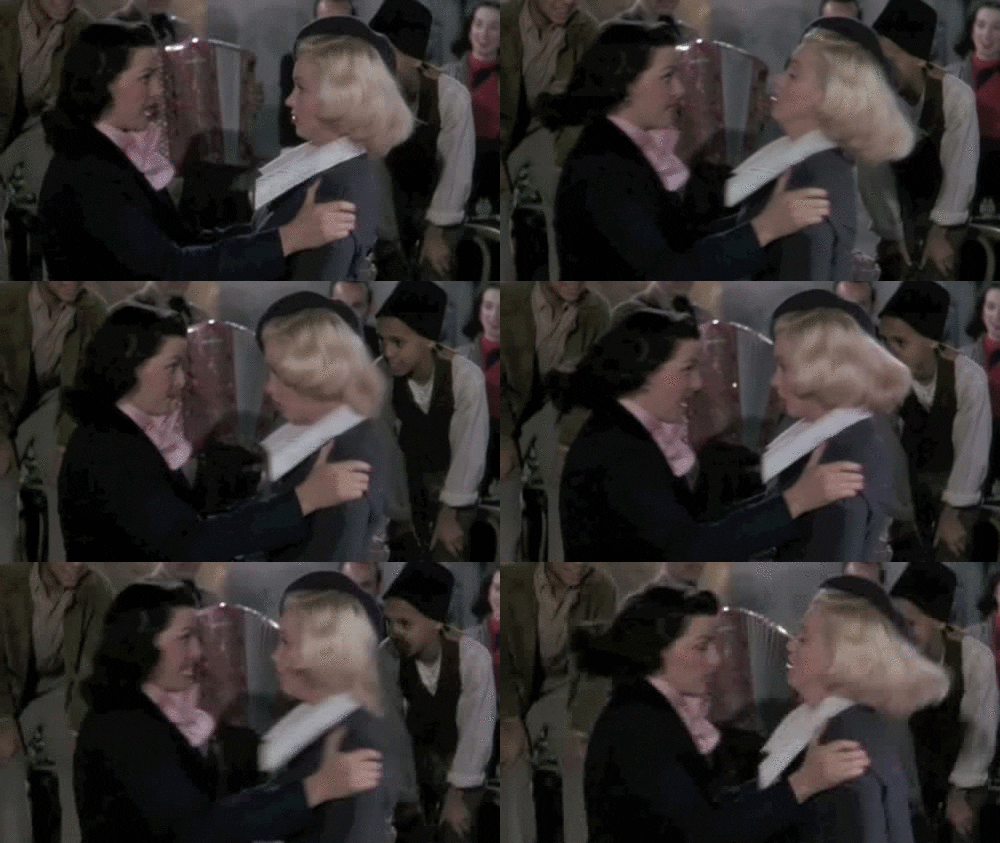
Structurally how I put together the scene here, I struggled a bit with what to do. Like what stop motion assets were needed and what could be done simply since time was an issue. I went the geometrical symmetry route for aesthetic reasons only; basically, I just played around. My initial idea was a ball in a hive of bees, but that wasn't enough visually; since I had been introducing so much already, things wouldn't have been balanced. I ended up taking bricks of green clay, putting balls on top and painting them green and then having faith in Ae that I could enhance things on another level later. Visually I used Gifs of vintage love scenes from movies, sexual functions in the body under the microscope, bees because of the obvious pheromones and a Gif of just legs playing footsie. I overlayed everything with a tapestry from Cooper Hewitt.
Make it stand out
My very abstract stop-motion assets are almost Japanese-like sculptures.
Make it stand out
Scene 6:
Lyrics "Undividable" & "It feels way too chemical"
For this part, I just reversed the previous stop motion assets, for at this point, I was getting tired and wanted to get to someplace definitive before I showed it to anyone and only had a few scenes left. For my process, since all parts dictate each other, I do them hand in hand, meaning I do my stop-motion, then do Ae, then more Ae and a little stop-motion once I get stuck with all options in Ae. Since this class was all about learning Ae, I decided that I should do as much as I could in Ae and picked very simple stop-motion sequences.
Since I was nearing the end, I wanted to do a B&W image over the work similar to the beginning, so I searched for an image that spoke "undividable", and then the thermometer was mostly influenced by the beats in the music.
Make it stand out
Scene 7:
Lyrics "Ooh, yeah"
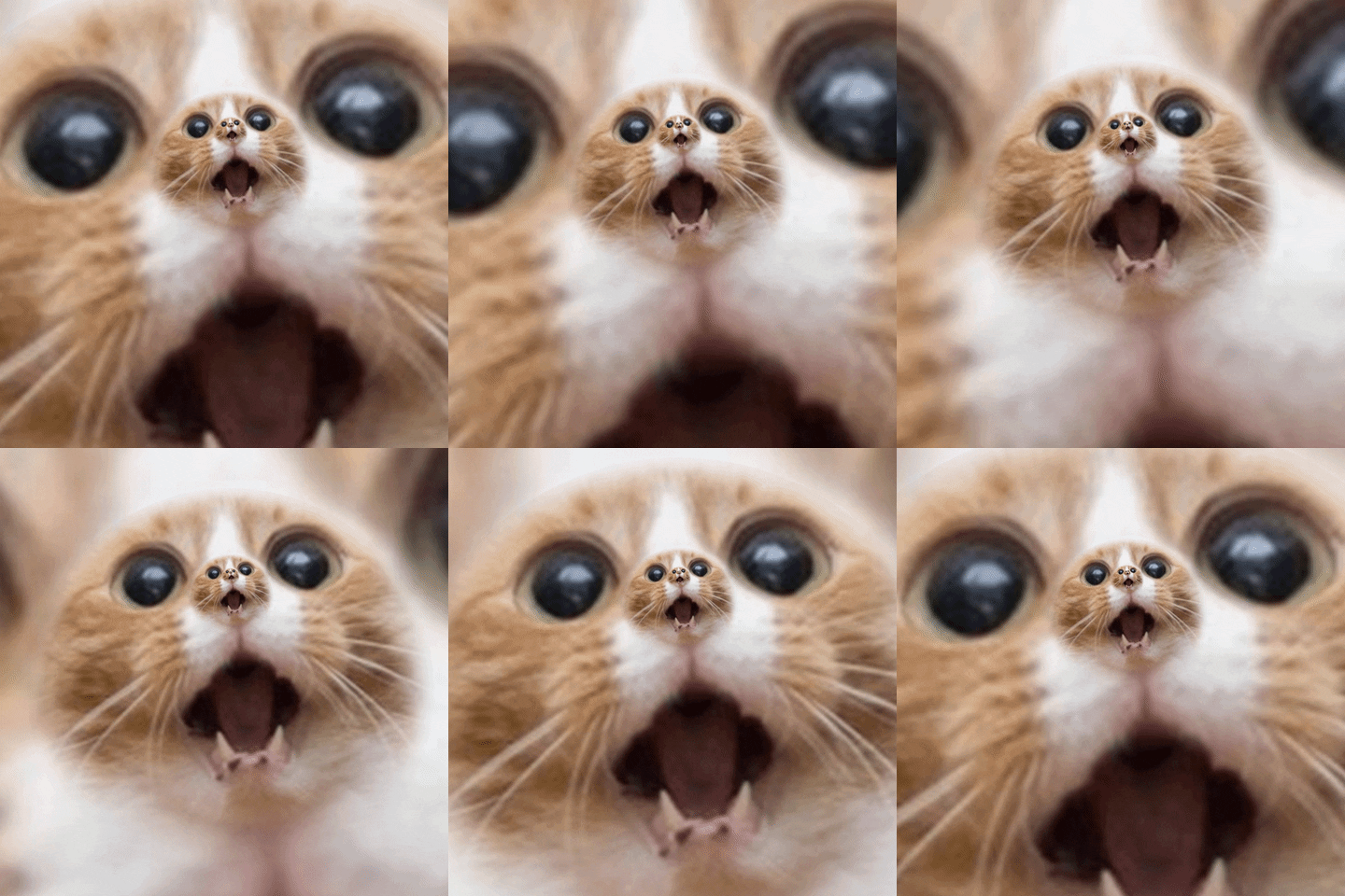
My original storyboard didn't have an "Ooh, yeah" scene, but I felt that it was such a moment of wonder and could reinforce my themes of childhood nostalgia and first loves, and love for home. So I threw in some crazy cat pictures and kid from a vintage commercial that looked like he was singing and called it a day. But in all honesty, this was about innocence.
I built the scene using still images I took of a net I bought off some ghetto Nepali online marketplace and a wooden box I had. My attempt was at recreating a ping-pong table, and I tried multiple ways to do that under a tripod, and this was the only one that remotely worked. I took all pictures on top of my green table so I could put an image underneath in Ae. This image is also from the Cooper Hewitts collection, and it is a clock design with a cupid.
Make it stand out
Scene 8:
Lyrics "You're the height of my concern"
So every character needs to change in a story, and I had to show my change, so I had him change his lipstick in this scene. The King Kong reference picture talks about the height of concern one has for someone, and the Forrest Gump gif references that internally.
Make it stand out
Scene 9:
Lyrics "I can't deny that I want you here"
Finally, the ping-pong got his man! Or decided to take his man. Wait, you didn't know he was gay. Well, I decided to make the last scene more inclusive because I was sick of all the straight images that are out there for creative assets. Even the Smithsonian Open Access is super hetero.
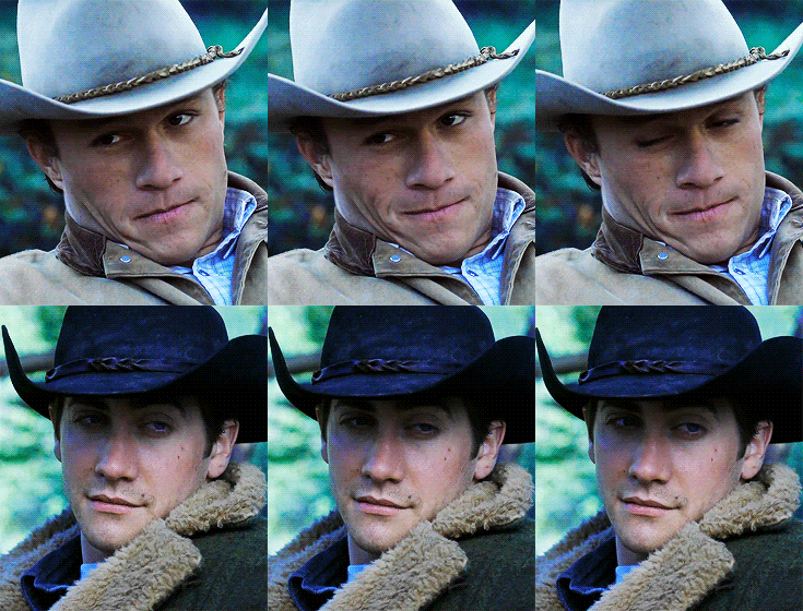
The layout of this scene is that the ping-pong ball goes back to where he came from, there is a reference to Brokeback Mountain on the ping-pong ball on the paddle, and the word Brazil in neon suggests they are off on holiday. I changed the colour of the paddle, too, to match his lipstick, so it shows that there isn't so much of a power dynamic. And the two paddles in the foreground have a ping-pong ball with a tattoo that says "I love Daddy" on it, which references gay culture.
The first takeaway:
What I learned most was that my storyboard was just a place to jump off from, for the creation happens when you are actually making it. I deviated significantly because things didn't work for me on both a narrative and visual level. This may mean I need to work harder on storyboarding or that my creative process is intuitive, organic, and informed by the objects and visual assets I work with.
Although the work is very abstract, there is an attempt at meaning behind it, and I'm trying to see if that is conveyed or to what levels of literalness I need to go. I also like to play with music and language, how we interpret words out of context, and how do listeners, as speakers of English as a second language, comprehend it with limited English. I'm obsessed with all ways in which we communicate, and that is why I like to visually use image aids in my work to bring home larger meanings. I find Gifs like modern-day Chinese characters with so much information packed into them.
Use of colour:
After reading so much on colour theory over the week making this, I should explain my use of colour, but I must admit I'm perplexed by my use of colour and how I come up with the combinations I use. I put a lot of thought into them, and I think there is consistency; however, it is an area that I should be aware more of, and I recognise that.
For example, why did I pick colour #E7D724 for the Cooper Hewitt tapestry that is overlayed (blending mode darkened) in scene 5 above? Because its original colour was #9B4343, but I changed it by using the "change to colour" effect in Ae. Well, my reasoning would be that it had a similar tone to the wooden paddle in the previous scene, and the #E7D724 reminded me of the drapery in the iconic "My Favorite Things" scene in Sound of Music. It also reminded me of bad breath.
So yes, my use of colour is out there, and after doing all those readings, I'm confused by it. It will be something I just need to explore and think more about. I'd like to say my use of colour is similar to a "garage sale" in that I take tons of colours and imagery (anything that one would find in a hoarders garage), put them side by side on the screen (like putting them on the lawn), some clash and some work but at the end they sell.
Articles on colour:
Colour Theory: Brief Guide For Designers by Alina Arhipova
Colour Theory: A Jargon-Free Designer's Guide by Sam Hampton-Smith
Colours and Emotions: How Colours Make You Feel by Allison S. Gremillion
The Science of Color Explained by Art by Invaluable
The final:
In the end, I finally made it to the 60-second mark, and I'm glad I did it because just 30 seconds was too short, and by repeating the graphics and structure, albeit slightly diverging from it to make it more interesting, I think it delivers a more thorough narrative. The first 30 seconds felt stifled for breath a bit, and here I wanted to make it breathe more; although the tempo is faster (a struggle to work with in transitions and I agree that I haven't succeeded completely) and, therefore, the visuals come at a faster rate, it does give some definitive power.
I learned a lot, and I will continue to investigate my use of colour. I like what I read on p. 111 in Design is Storytelling on Pixar's use of "colour scripts" that map out moods in a film. I will try that in my own ad-hoc way in my next endeavour.
Make it stand out
I ended my ping-pong love adventure with a "the end?" typewriter script imprinted into the paddle handle, so I may revisit this in the future because the relationship struggles between a ping-pong ball and a paddle seems to never end.
Artists who worked on this video:
Joey Foster Ellis
Sandhya Karki
