Beyond the Binary: Bridging the Divide Between AI and Human-Crafted Logos
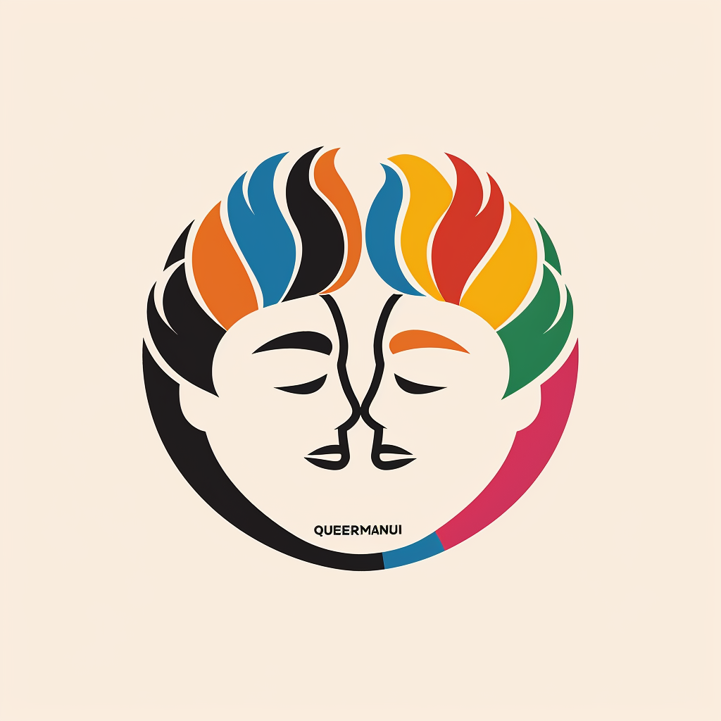
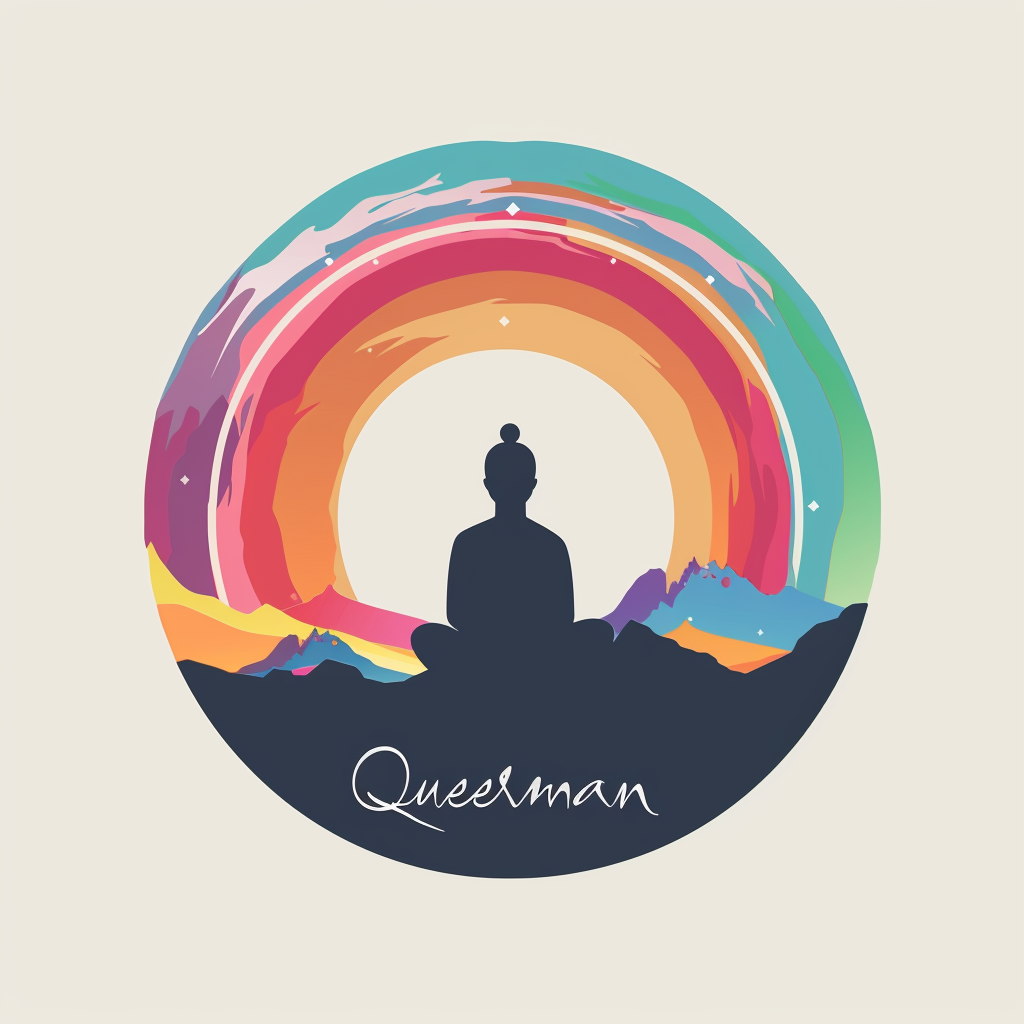
AI Prompt: A flat vector logo of for a queer travel brand in nepal, minimal, by Paul Rand
Embracing the New Horizon: A Fusion Approach for Queermandu's Brand Identity
As a recent advisor and board member for Queermandu, a burgeoning Nepali queer travel brand, I've embarked on a fascinating journey. Tasked with nurturing and developing the brand identity of Queermandu, I found myself at the intersection of tradition and innovation. The initial suggestion of hosting a logo contest was driven by a belief in the unmatched value of human creativity over AI-generated content. Yet, as I delved deeper into the world of AI design, my convictions began to waver, leading me to ponder a significant shift in perspective.
A Designer's Dilemma: The AI Attraction
As a designer, I've always championed the human touch in creativity—believing in the depth, emotion, and personal connection that human-crafted designs bring to the table. However, the vast and diverse world of AI-generated content has unexpectedly captivated my designer's heart. It's not just about the efficiency or the novelty; it's the sheer possibility and diversity of designs that AI can produce which has me questioning. Has my taste evolved? Or are we, as a collective creative community, entering an era where AI-generated content is not just a tool, but a partner in creativity?
The Fusion Proposition
This introspection has led me to a groundbreaking proposition for Queermandu: a fusion of human creativity and AI innovation. This isn't about choosing sides but recognizing the strengths and limitations of both realms. AI brings to the table an endless well of inspiration, a starting point from which human creativity can take flight. The challenge with AI-generated logos—particularly the absence of thoughtful typography and the tendency towards clichéd imagery—highlighted the indispensable value of the human touch, especially in conveying the brand's unique narrative and emotional depth.
The Role of Typography and Human Touch
Despite my growing appreciation for AI's potential, the importance of typography in Queermandu's logo has underscored the irreplaceable value of human creativity. Typography, with its subtle nuances and ability to evoke emotion, requires a level of intentionality and understanding that AI, at least for now, cannot fully replicate. It's here, in the crafting of text that speaks to the soul of the brand, that the human designer's role becomes indispensable.
A Shift in Strategy: The Logo Contest Reimagined
The logo contest for Queermandu, therefore, takes on a new dimension. It's not merely a competition but a collaborative exploration of the fusion between human ingenuity and AI's potential. This approach invites designers to engage with AI in their creative process, using it as a muse, a collaborator, or a challenger, but with a clear directive: the final embodiment of Queermandu's identity must weave in the indispensable human element of typography, storytelling, and emotional resonance.
A Call to Creative Arms
This pivot in strategy is more than just a search for a logo; it's a call to redefine the creative process in the age of AI. It's an invitation to designers, artists, and creators to explore this new frontier, to question and challenge their own biases towards AI and human creativity, and to discover a harmonious blend that elevates our work to unprecedented heights.
As we embark on this journey with Queermandu, we're not just crafting a brand identity; we're setting the stage for a new era of design. One where the fusion of human creativity and AI innovation opens up new vistas of possibility, making us wonder about the untapped potential lying at the crossroads of technology and human emotion.
The Results
In our journey through AI-generated designs for Queermandu, we discovered recurring themes that both showcased AI's capabilities and revealed its limitations in fully embracing the spirit of a queer Nepali travel brand. The vibrant use of pride colors, often depicted through stunning sunsets, alongside the majestic portrayals of the Himalayas, emerged as prevalent motifs. While these elements carry profound symbolism and visual appeal, they veer towards the realm of well-worn visual tropes commonly seen in travel and LGBTQ+ branding. A notable omission in these AI-generated designs was typography—an oversight on my part as the prompter, which inadvertently highlighted a critical gap.
The absence of text-based elements resulted in a loss of direct engagement and distinctiveness in communication with our audience. This reliance on familiar, albeit clichéd, visual themes without the complementary depth that typography brings, underscored the indispensable need for a bespoke, human-centered approach in crafting a logo that genuinely embodies Queermandu's unique identity and ethos. Hence, the decision to launch a contest becomes clear, as it reflects our commitment to transcending AI's current boundaries, ensuring our brand's visual identity is as nuanced and vibrant as the community it represents. This realization underscores the fact that reliance on AI-generated imagery alone is insufficient for our ambitions.
Extra
For a creative twist towards the conclusion of our session, we uploaded some AI-generated logos we favoured—sans text—into Midjourney. Then, we introduced the prompt, "a logo with the words QUEERMANDU written on it." While none of the results were spot-on, they offered intriguing elements that could inspire our final design.


